
This weeks video is all about colour. We’ve covered colour before on more than one occasion, first with white balance tweaks, then with colour changes, then with correcting colour casts and finally with setting white balance in camera. However, colour seems to be a constant point of pain for a lot of the community so this week I wanted to share a technique I use to fine-tune colour.
Now, this technique does need you to know what colours should be present in the image in the first place. If you have no idea, you will struggle. It is also useful to learn your colour opposites. The most basic opposites are:
- Blue -> Yellow
- Green -> Magenta
Mixing those 4 gives you all sorts of colours, but the complex opposites are:
- Red -> Cyan
- Green -> Magenta
- Blue -> Yellow
- White -> Black
That set gives you much more flexibility, but you can make cyan with your top two and so on… Therefore, you just need to be able to identify colours and you can do this method.
The steps involved in this can be seen in the video here:
Really, the technique is simple:
- Open an image in a photo editing program like Adobe Lightroom or Adobe Photoshop
- Find the vibrance and saturation sliders
- Pull both all the way up to the maximum
- Assess the image in places where you know for sure the colour(s) that should be there.
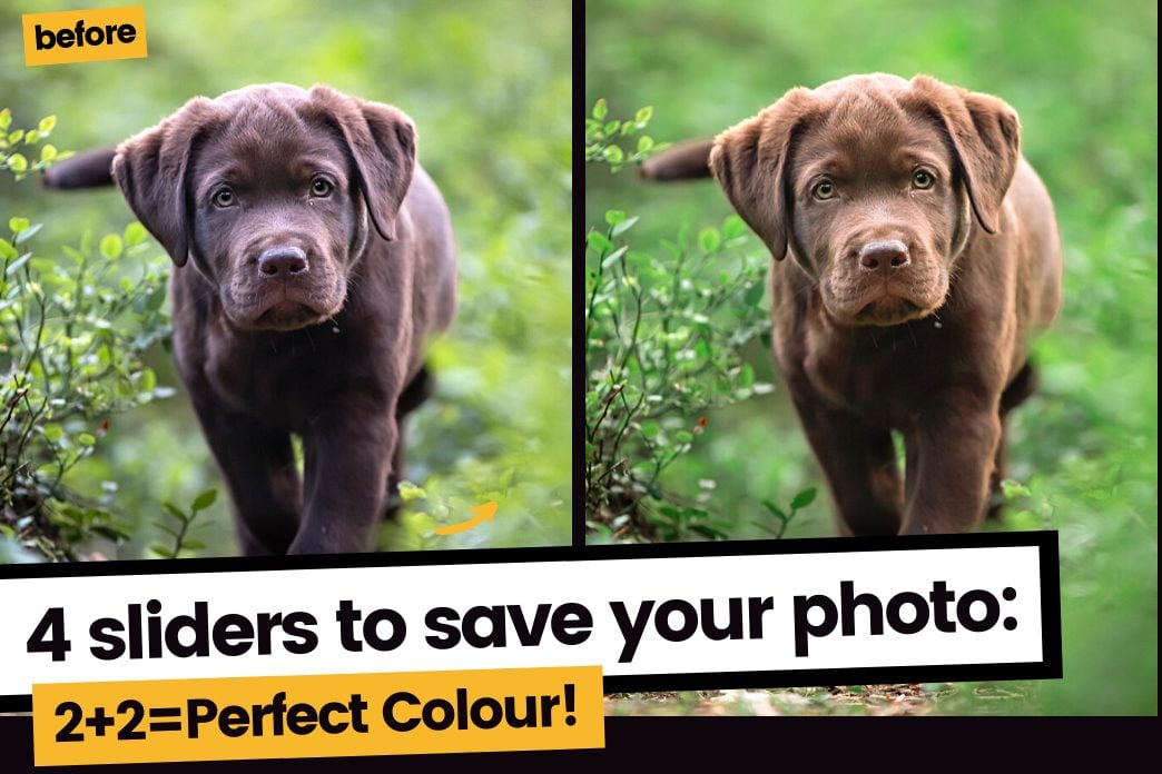
For example, a brown dog shouldn’t have blue or green on them. - Find the temp (yellow/blue) and tint (magenta/green) sliders
- Pick a colour that you know should not be there in the image – focus solely on this colour.
- Move the slider on tint or temp, whichever involves the colour you need to remove, until that colour seems to disappear from the part of the image you are looking at.
It should be replaced by another colour (or no colour, if the area should be grey or desaturated). This is fine. - If there is another colour that has appeared that shouldn’t be there (also normal), tackle this one next.
- Continue until you’re happy with the specific colours
- Move the vibrance and saturation sliders back to their original point of neutral
- Take a tea break and move away from the screen, the colours will look very flat and very dull because you’ve been looking at a neon-radioactive version
- Assess any fine tuning you need to do.
Now, it goes without saying that you need to be looking at accurate colours, so consider calibrating your monitor to ensure you get the best results possible.
Jx